Maximalist Design: How To Experiment With The “Bolder Is Better” Style
I really love maximalism. It’s such a fun way to approach design if you love bold spaces and color. . .
. . .or if you’re a total magpie like me who hordes weird old stuff, interesting trinkets, and other odds + ends.
Maximalism really boils down to TWO overarching categories that we’ll dive deeper into:
Playing with COLOR in a space +
Playing with STUFF in a space.
Your color palette and contents/decor (stuff) makes up the meat of a maximalist room. From there it’s kind of like those “Choose Your Own Adventure” storybooks we read as kids that had multiple outcomes. Is there a certain theme or vibe you want your space to invoke or embody? That may help you choose an avenue to wander down as you’re picking out colors, textiles, and decor. The rules are pretty much non-existent after that. . . The world is your oyster!!
Source: Agi at 59
Like I said, I love this Bolder Is Better/More Is More trend. I’ve written another post attached below which shows a dozen+ rooms that go over the top with their bold color choice, wacky decor elements, intricate & unique details (like painted ceilings), or some magical combination of elements. . . In their own different ways, they’re all completely fabulous. And what I love most is how each space demonstrates different ways of incorporating maximalist bold design into a space.
check out my post here on more yummy max spaces:
Whether you have to get creative with your budget (like me), or you’re rocking a 750 square foot apartment. . . there are lots of different ways to play with bold design and dip your toe into the maximalist aesthetic. So regardless of your style: from the wacky and over the top, to the unapologetically luxe & lush — here are some delicious maximalist tips and tricks to your design repertoire.
Don’t know where to start? We’re here to help! We’ll cover tips, tricks, how-tos incase you:
live in a rental and can’t go too crazy
have a small space
have a tight budget
Source: Apartment Therapy
Source: The beautiful house “Melmitchia”
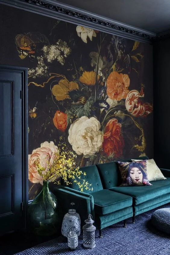
Wallpaper Source: Surface View — Room spotted on: Homeology
This page contains affiliate links, which means I may earn a small commission if you use those links. For more info please see my Disclosure here.
so you live in a rental and you can’t go too crazy?
That’s us, too! If you’re in a short-term lease and you want to try your hand at maximalism but you’re not sure how, here’s our best tips:
Remember the Three P’s:
Plants, Pictures, + Patterns. These three elements are easy enough to layer and pepper into your rental space if you don’t want to change up your walls, and that you can easily take along with you to your next fabulous space.
PLANTS — Check out my Green Thumb Pinterest board here with lots of suggestions for easy indoor plants, tips for keeping them happy, watering schedule charts, info on how much light certain plants like, and more!
PICTURES — Remember your frames don’t necessarily need to match! Lots of spaces incorporate a hodgepodge of different styles and frame colors that end up looking harmonious once they’re all together. Lay them out first and see what you think so you can arrange them as you like.
And if you want artwork everywhere like I do but you don’t want to put nails in the wall I DEFINITELY suggest investing in some 3M Brand removable plastic wall hooks/picture hangers. They come in different packs + sizes that can hold different amounts of weight depending on how heavy your frame is. And when you move out, they detach from the wall easy-peasy and won’t leave holes in the walls that you have to go back through and spackle.
PATTERNS — don’t be afraid to go for it! Depending on your aesthetic + style, pick a color palette and start looking at ways to layer prints + patterns into your space. Think throw pillows, curtains, accent rugs + furniture, and those previously mentioned pictures + plants! When you start layering and playing with patterns and prints take a good look at how things play together: geometric designs, animal prints, classic patterns, abstract prints, etc.
Removable Wallpaper.
Don’t want to paint? (Or more accurately. . . don’t want to repaint everything back to white when you move out?) It’s 2020 y’all, don’t forget about wallpaper! It’s a fabulous route for renters! You don’t even have to do an entire room — a single accent wall makes a really cool feature. When choosing a pattern or print, see if there’s a picture online of how it looks in a space — we recommend going for larger prints and patterns. . . A smaller pattern can look “busy” or the detail you love so much can easily get lost.
Lots of companies — even Urban Outfitters — make removable wallpaper patterns nowadays that are zero commitment; they come in convenient panels and remove without fuss when you move to your next fabulous place. My post attached below has some good tips and tricks to keep in mind if you are planning on doing a wallpaper DIY install.
check out my other post: wild wallpapers making us say yolo here
<< Keep reading-on to check out a few rooms that use their wallpaper strategically in small spaces - as well as in lots and lots of fabulous pattern-rich layers.
Rugs, Drapes, + Textiles.
Don’t forget about the power of an amazing rug! You can have bare white walls and no special furniture pieces to speak of, and a cool rug or pair of curtains can transform the room instantly.
I love Wendy Morrison Design’s amazing rug patterns like her leopard & floral rug shown here,
or the deliciously golden chinoiserie inspired rug shown below.
Check out her work for some awesome maximalism design tips to help inspire your brain and fuel your creativity!
Source: Leopard Florals Rug by Wendy Morrison Design
Feature Gallery/Artwork Wall.
I think it’s easy to assume in the love of maximalism that white walls are a bad thing. That’s definitely not the case and rooms like the one pictured below prove how a feature wall of artwork grouped together gallery style can be really cool, eclectic, and impactful. Lots of gallery walls embrace mismatched frames, and work them all together like members of a family. Feature gallery walls are also a perfect choice for renters who can’t commit to painting the walls as easily.
Source: Doris Leslie Blau
Click here to shop all my favorite things,
and peep the list below to
some shoppable statement pieces that can
pack up and move with you:
Source: Noz Design. Photography by: Colin Price Photography
2. so you live in a tiny apartment or a small space?
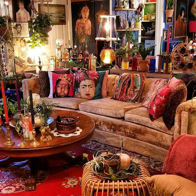
That actually may make it easier! So much of maximalism is about toeing that fine line between clutter and an eclectic curio. Sometimes in a smaller space you don’t even have an access to one big wall! If that’s the case, start with an interesting corners or a small area that gets great lighting, and start building and layering your artwork, books, collectibles, collections, souvenirs and knick-knacks all around it. Don’t be afraid to use up lots of space — several maximalist rooms you’ll see take up every inch available!
Turn your space into a living museum, gallery, jewelry box. . . you name it! Pack it together, tell a story of you + your adventures, and let your personality shine.
Here’s some of our favorite spaces that got really creative with their limited footprint — just went for it, and packed a royally powerful punch.
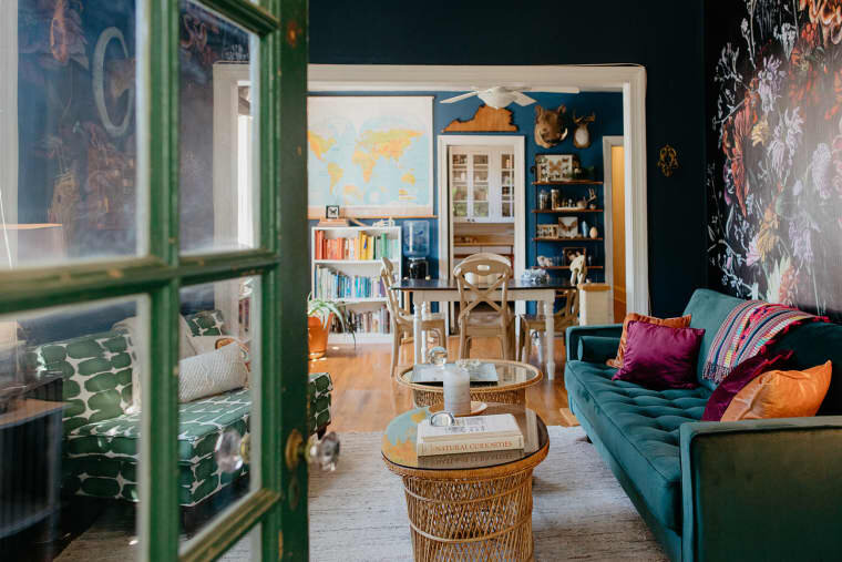
The picture shown above and to the right is of a cute little 750 square foot rental apartment in our beloved hometown of Richmond Virginia!
Can you tell Naomi is a nature illustrator? I love the wallpaper mural accent wall and all the flora + fauna artwork. All the blues + greens in the walls, furniture, and decor lead your eye easily throughout the space and tie it all together in a neat little package. . .
How adorable is this 750 square foot Richmond Virginia apartment? Home to Naomi + Freddy. Source: Apartment Therapy
Oh, and the color-coordinated bookcase? I see you over there! This space gives me major heart eyes, and not just because I love RVA.
Source: Apartment Therapy. Photography: Viv Yapp
Kathryn Hayden Photography. Source: Apartment Therapy - Cincinnati loft of Kate Beebe
Small spaces can be really the best for making a super impactful feature wall, neat artful stacks of books, a cool wallpaper mural feature. . . you name it! Sometimes having a large space can be daunting to a maximalist because it’s a lot of square footage you have to figure out how to fill up. Take advantage of your smaller space and flood it with your personality.
Seen in: The English Room
Source: Apartment Therapy
Source: Design Junkie. Artwork by: Alexandra Gallagher
Source: Design Junkie
3. so you’ve got a tight budget?
Source: Audenza
Our best tips if your budget is tight? Get thrifty, get creative, and focus on color.
Take a good close look at the rooms we’ve posted here. . . SO MANY of the fabulous treasures you see sprinkled throughout several of these spaces could 100% be antique + thrift store scores. Which means. . .
it’s time to get thrifty!
Some of my favorite things in our house are items we’ve found over the years at thrift stores, antique stores, flea markets, estate sales, beside a trash can in an alley… you name it! I also like to search at Home Goods, Ross, TJMaxx, World Market, and some of those type stores because you can often find some really cool statement pieces for a really great deal!
And if you’ve got a penchant for doing things DIY or making things with your own two hands. . .
it’s time to get creative!
Source: Apartment Therapy. Photography: Viv Yapp
Source: Apartment Therapy. Photography: Viv Yapp
There are lots of awesome decor projects you can find on Pinterest and video tutorials on YouTube that walk you through how to make awesome design pieces out of Dollar Store or common thrift store items. (Just like the ones attached below!) Part of the fun for me when designing a space is trying to find creative ways to recreate the amazingly luxe and expensive stuff that I like but can’t afford.
“Makers Gonna Make-ALL THINGS CRAFTY” <— Check out my pinterest craft + diy board here for idea inspo
This starburst mirror is a perfect example of an easy DIY project that can add some bold bohemian pizzazz to your space; and it’s a project that’s been on my list for ages now. I’ve seen so many cool tutorials using just a dollar store mirror, some barbecue skewers, a glue gun and gold spray paint. So easy!
Check out the tutorial videos and articles for some of these different styles below.
Getting thrifty and creative can really help stretch your design dollar — and there are thousands of projects out there that don’t require much more creativity than literally being able to hold and operate a glue gun. In other words: YOU GOT THIS.
Our last tip if your budget isn’t huge +/or you don’t want to accumulate any more “stuff” is to really think about color. It can be just as impactful and maximalist as a room full of interesting knick-knacks — and if you really study some of the rooms we’ve shown here as well as in our Maximalist Rooms That Give Us FOMO post you’ll notice that several rooms do just that.
$50 spent on paint can go a really long way and will definitely make whatever artwork or decor you display really stand out and pop.
Click here to shop all my favorite things,
and peep the list below to
shop my favorite budget-friendly statement piece staples:
Take a peek inside the home of one of my favorite up + coming interior designer, UK-based Rachael Havenhand.
If you want to be inspired by the power of a coat of paint and color choice, you’ve come to the right place. Every inch of the home she’s created for her family sparkles and shines with personality, whimsy, and irreverent fun. She also sells some of the prints she’s designed and created for her space on her Etsy shop!
Rachael’s House:
A peek inside Rachael Havenhand’s amazing space. Source
I’m kind of in love with Rachael’s absolutely irreverent design-aesthetic. If you want to ogle more of her technicolor home click the link below to read my feature post on her!
spotlight feature: Rachael Havenhand. designer? or rainbow incarnate?
On with more maximalist specimens!
Source: The English Room
Source: The Interior Editor
Source: HGTV
Let’s review some of our fave ways to spice it up + go maximalist in your space:
layer, layer, layer
It all comes down to the fine art of layering in Maximalism. Layer your colors, textiles, decor, collections, books, souvenirs, knick-knacks, etc… Remember more is more; and remember the three P’s: Plants, Pictures, + Patterns!
(some of These spaces prove that there’s no such thing as too many plants)
Flora and fauna in general is always a win. There’s no such thing as too much. Plants, flowers, and greenery will instantly create a lush, vibrant, jungle feel that is literally breathing life into your space!
And if you don’t have a green thumb or the ability to go crazy on the plant-buying?
Pictures of plants work, too! (Fancy that, huh?) Framed artwork of living things is another easy way to add some life into your space without having to worry about watering.
Animal Print is another fun design trend right now that lends itself really well to a layer-rich space. It works really well with plants and greenery and also creates that vibrant, lush, jungle feel.
consider a bold statement piece
Don’t have lots of room to work with? — Or,
Want to pack a punch without all the “stuff”?
An awesomely bold statement piece of furniture or a cool big piece of artwork; even thoughtfully chosen tile backsplashing can be impactful. Think BOLD!
And if your budget is your biggest hurdle, check out inspiration from before + after DIY projects on Pinterest then head to the thrift store and see if you can score a cool wood/metal piece of furniture in need of a new coat of paint! A bright piece of furniture in a room is sometimes all you need!
consider a funky wallpaper
Like we mentioned before, wallpaper is not the commitment and labor of love (and pain-in-the-assery) that it once was. If you’re still feeling reluctant, start with just a wallpaper accent wall. But if you really want to go for it with something fun that can serve as not only the wall color, but sometimes the artwork itself — consider a funky, oversized pattern wallpaper.
Check out some patterns I’m into on my post here: “Wild Wallpapers That Make Us Say Yolo”
Designed by Young Huh for the 2019 Kips Bay Designer Showhouse Reveal. Source: House Beautiful
The amazing rooms shown above + below are the perfect example of the power Wallpaper.
Designer Young Huh put together the room above as part of the Kips Bay Decorator Showhouse and chose a fabulously bold wallpaper from UK based design company Fromental (their wallpaper is essentially fine art). I love the oversize pattern with the splash of foliage in it.
The room below is quite the bold blend of layering, but I love it. The wallpaper patterns (that’s patterns - plural) that carry throughout the walls and ceiling, and again throughout the kitchen. . . are fabulous. The design even carries into the curtains and throw pillows! The walls and ceilings and cabinets all blend together and are then juxtaposed against the amazing tilework floors. It’s almost overwhelming. . . but when the dust settles you really see how harmoniously it all behaves together.
Imagine if the walls in either of these rooms were plain white?
How yummy is the tile work? Room shot by Douglas Friedman Photography - Source: The Tile Shop Blog
Source: Noz Design. Photography by: Colin Price Photography
Source: Casa Vogue
Source: Casa Vogue
fear not all the fabulous colors
I think if there’s anything maximalism teaches us it’s never to fear using color in a space.
With bold shades and tones you can lean heavily on the color to do most of the talking in the room, sometimes without needing any other artwork at all.
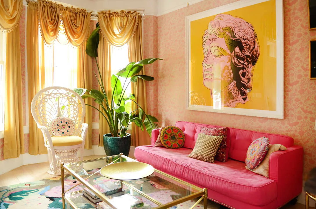
Whether you gravitate to bright spaces like this brilliant turquoise + hot pink living room on the right, or more dramatic spaces like the bold black room shown below — there’s really no wrong way to do it.
Source: Architectural Digest. Photo: Annie Schlechter
Source: Smith Honig
Source: Casa Vogue
When all else fails. . . Remember the Three P’s!
Play with that trifecta (plants, pictures ,and patterns), play with color, get creative and thrifty, and don’t be afraid to go for it. I’ve said it so many times before and I’ll say it again now — we’ll all be dead one day anyway — better to live to the fullest and in a space that reflects how awesome you are.
Source: Casa Vogue
Are you ready to try your hand yet?
Whether you want a space that’s more lively, colorful, interesting, bohemian, lavish, or wild, we hope you’ll incorporate some of the elements you’ve picked up from these dreamy maximalist rooms to spice up your space!


